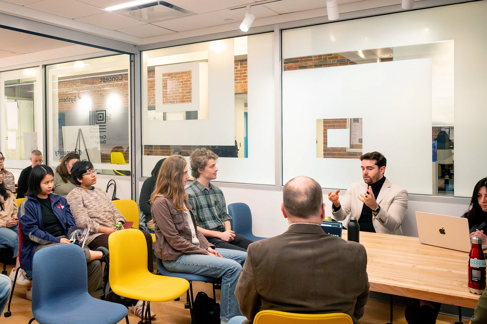
Research Centers at CAMD
The three centers at the College of Arts, Media and Design are hubs for interdisciplinary research; all are collectively conceived and shaped through joint initiatives led by accomplished faculty who excel in different disciplines.
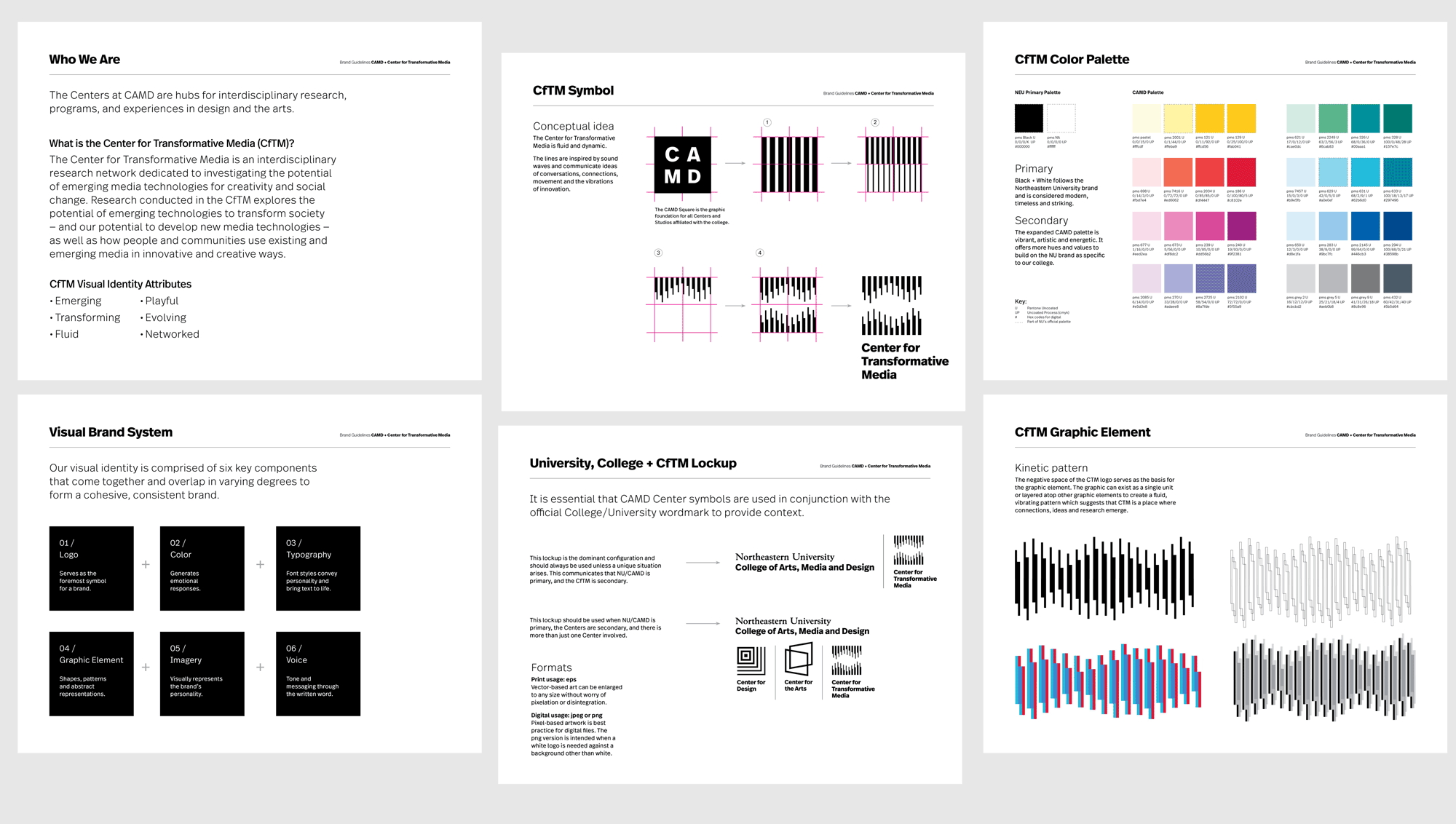
Situation: As a new entity, each center was in need of a symbol and visual identity to create awareness of its existence and promote its endeavors.
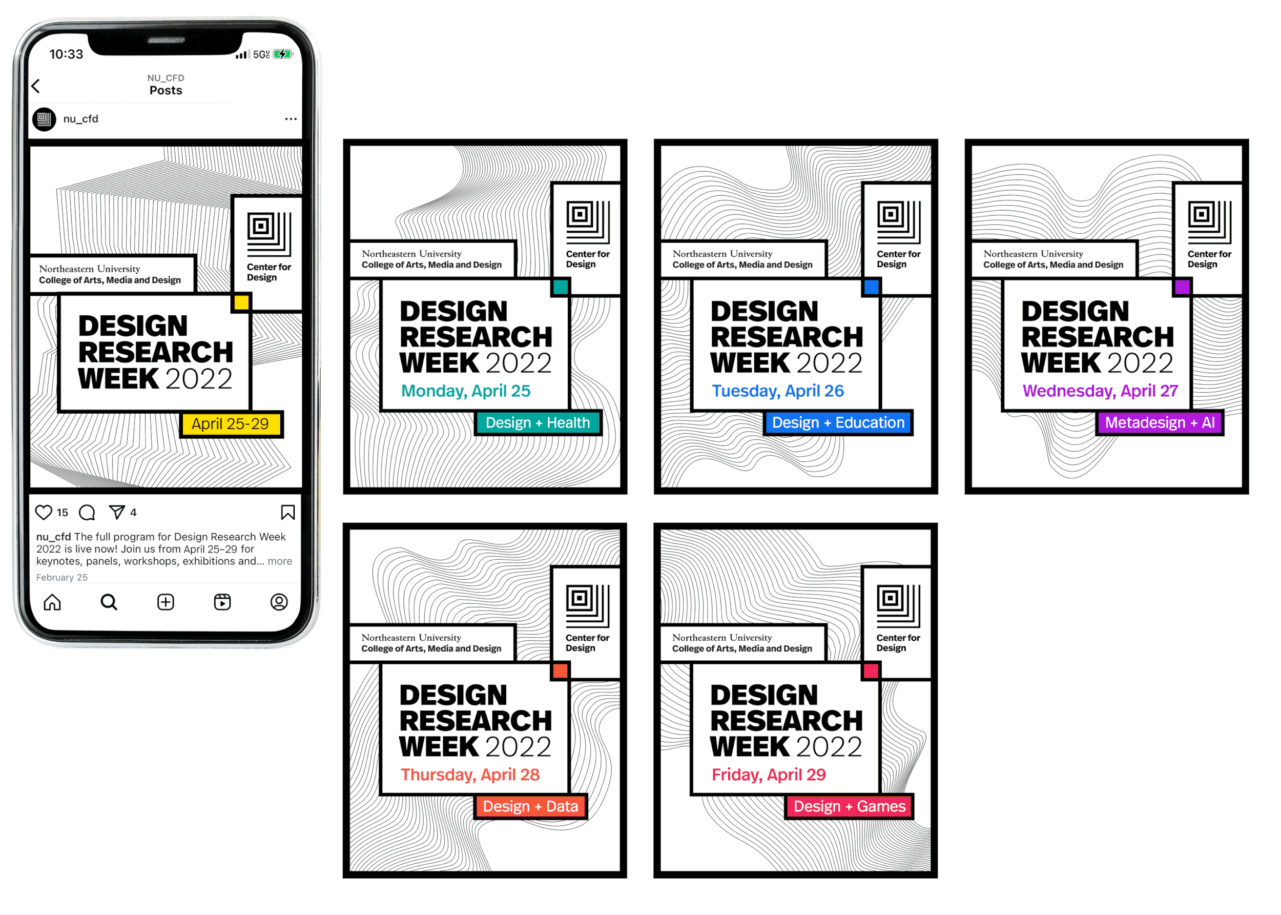
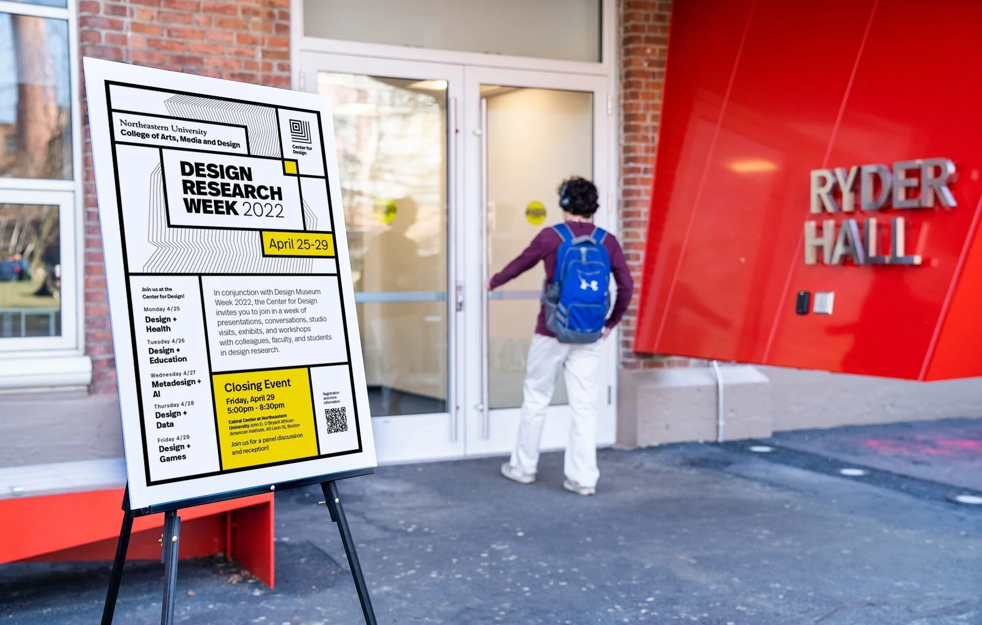
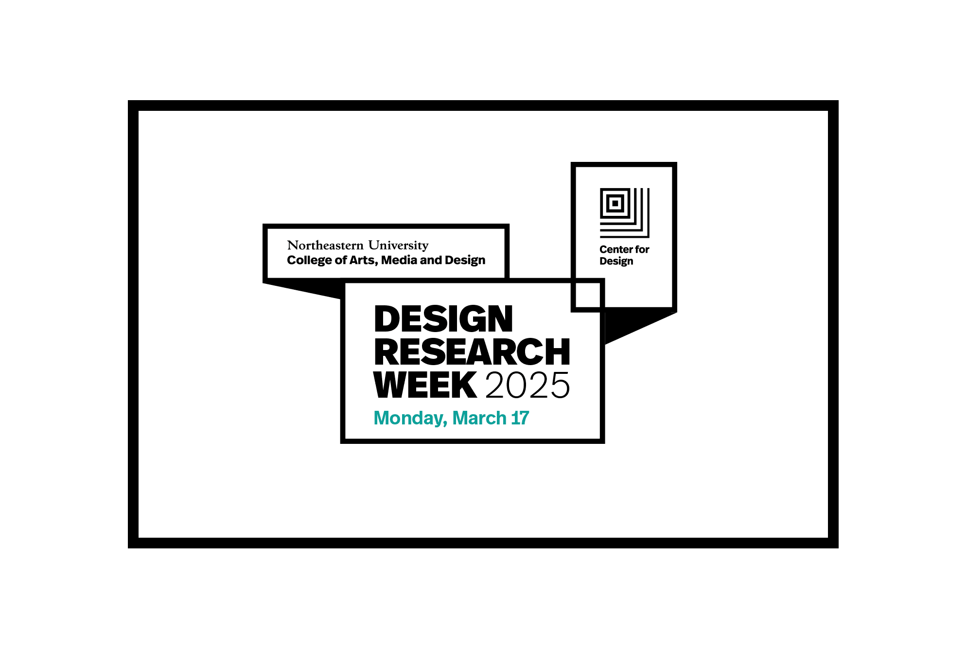
Results: Originating from the “CAMD square” (the graphic symbol of the college), the new logo is built on concepts that the Centers are places where ideas emanate. As a sub-brand of CAMD, the visual identity utilizes the same color palette and fonts. The visual identity for each Center diverges when it comes to representing complex topics and the fundamental nature of each area Added bonus: Each visual identity has a solid foundation for continuous evolution as it falls into the hands of other people for new content creation.
My role: Creative Direction + Design (while at CAMD)
Photographers: Kelly Chan, Marian Siljeholm, Rongrong Juno Zhu

Logos for the Centers originate from the “CAMD square” and incorporate the same naming convention.
Design support: (CfA) Cara Ciardelli / (CfTM) Rachel Osborne, Yenny Hernandez, Lily Diener / (CfD + CfA) Animations: Bryan Wu
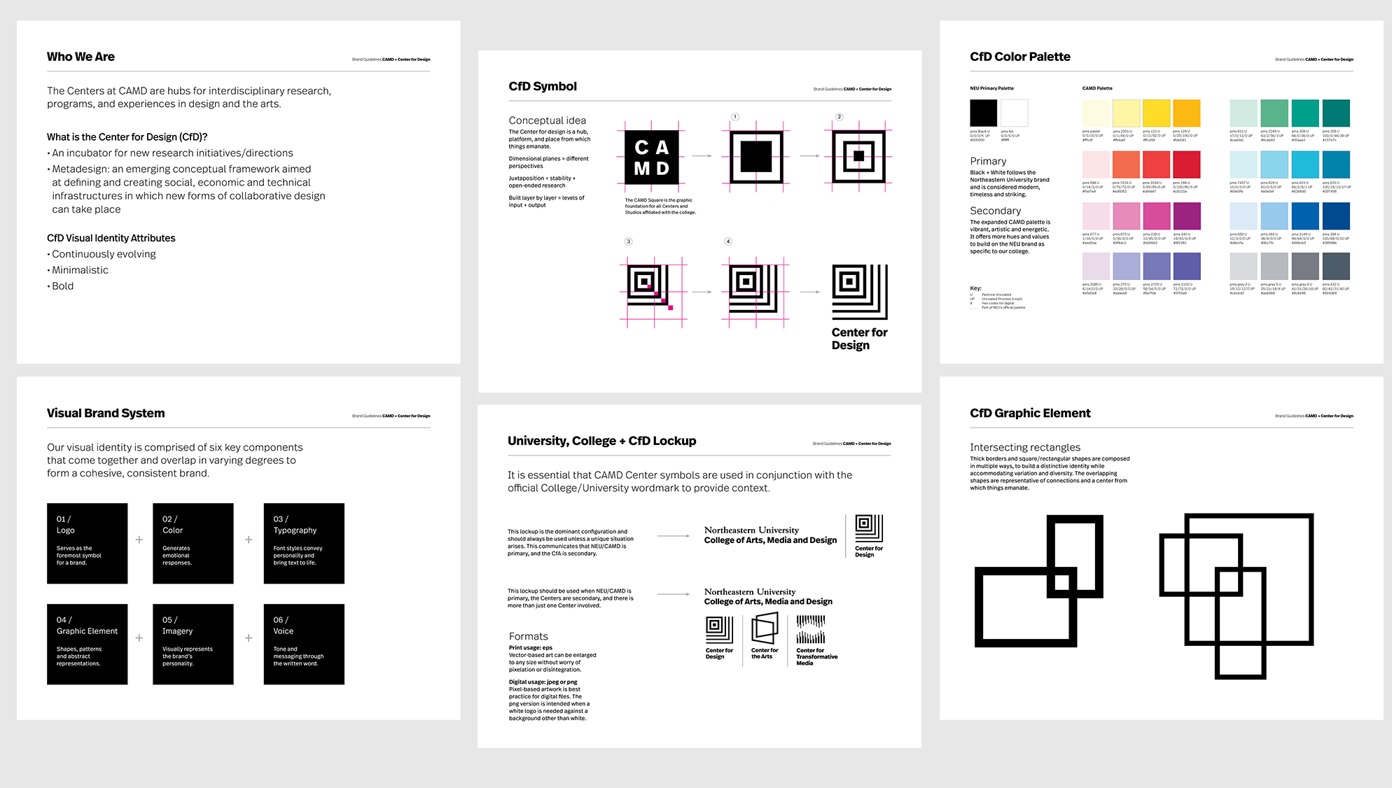
Brand elements use the same fonts & colors as a sub-brand of CAMD, with a unique logo and visual expression

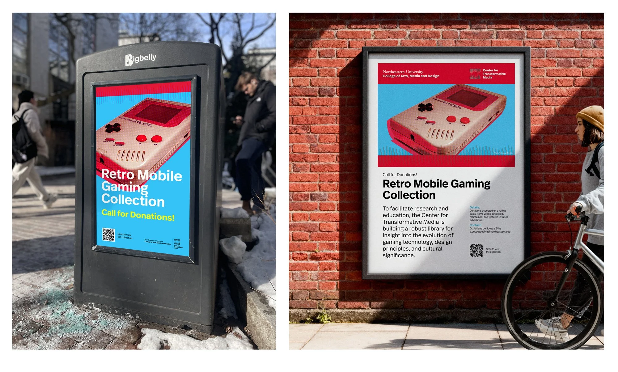
Environment vinyl graphics
Abstract graphics morph and communicate expansion of ideas


Collateral maintains modular elements, with a slight evolution / Design support: Laura Song, Cara Ciardelli

Daily themes are color coded
Brand elements use the same fonts & colors as a sub-brand of CAMD, with a unique logo and visual expression
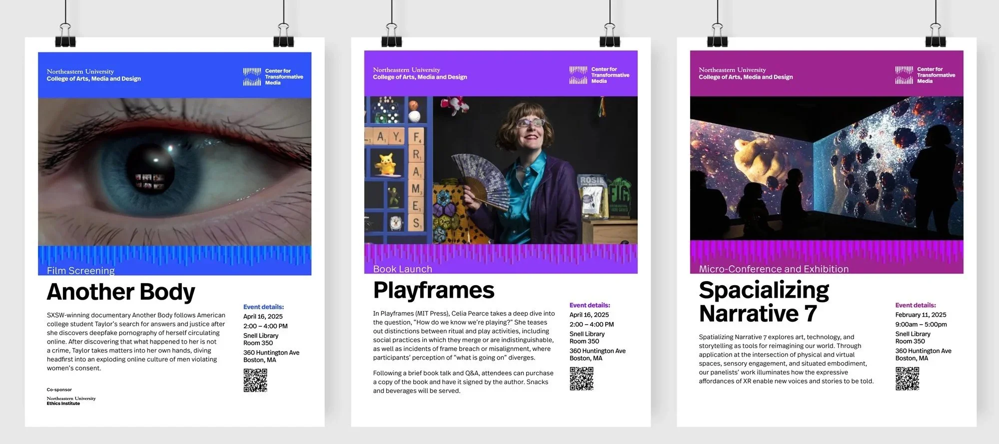
Event series posters
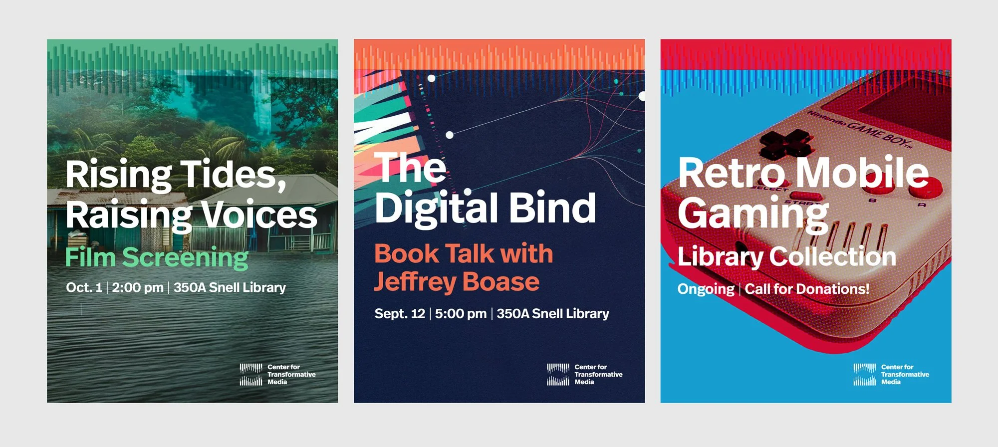
Event series digital assets